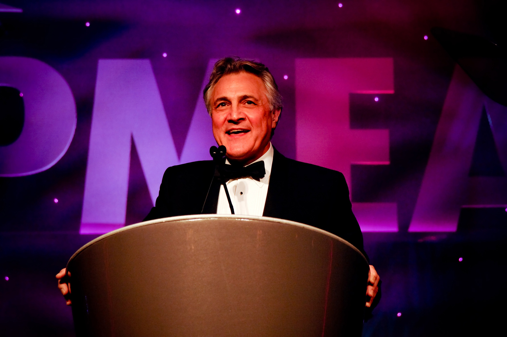
PMGroup hosted the eighth annual Pharmaceutical Marketing Effectiveness Awards (PMEA) at the Dorchester Hotel in London, to recognise and reward excellence in marketing within the pharmaceutical industry. My role for the awards scheme was lead designer and art editor.
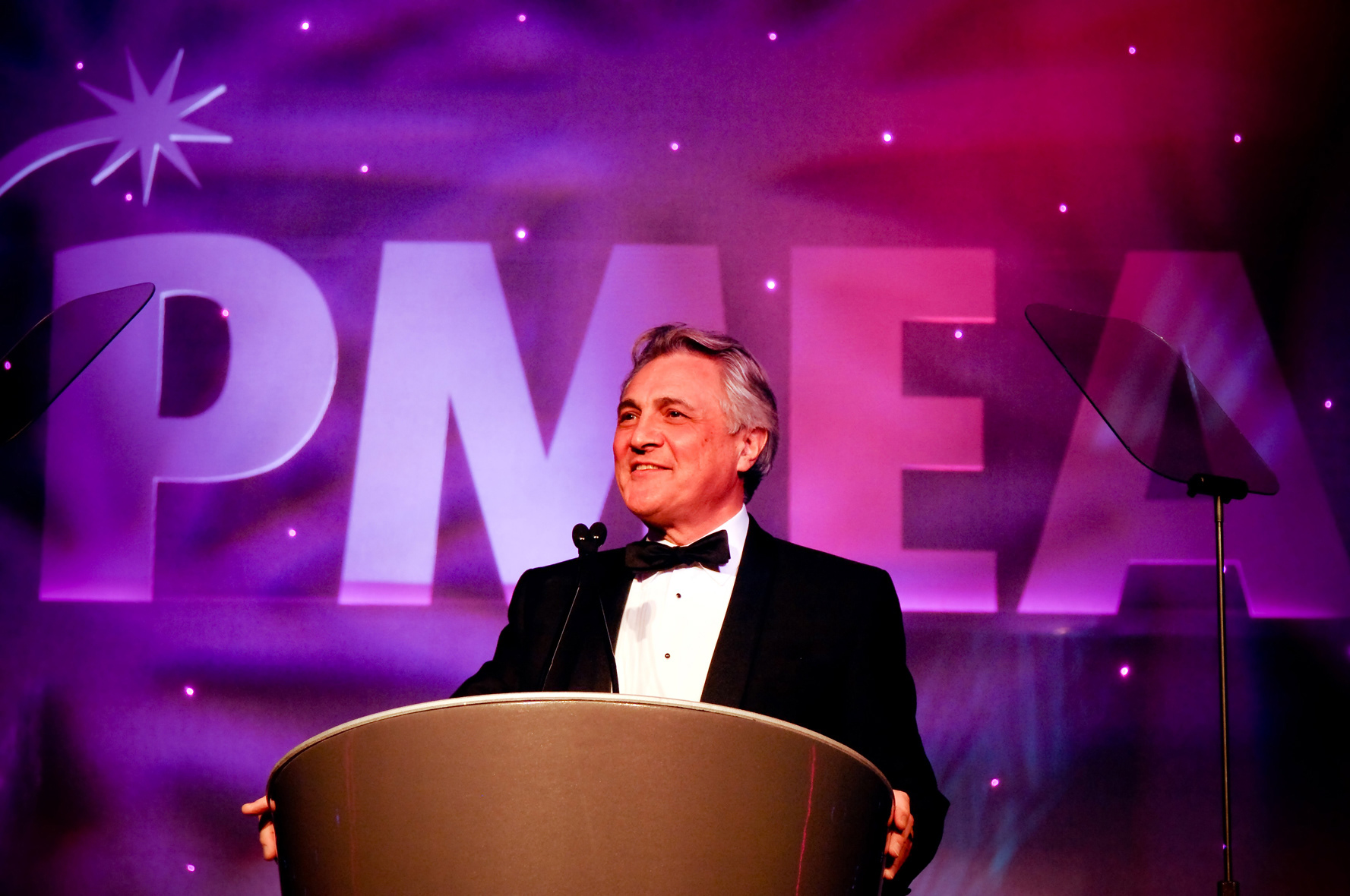
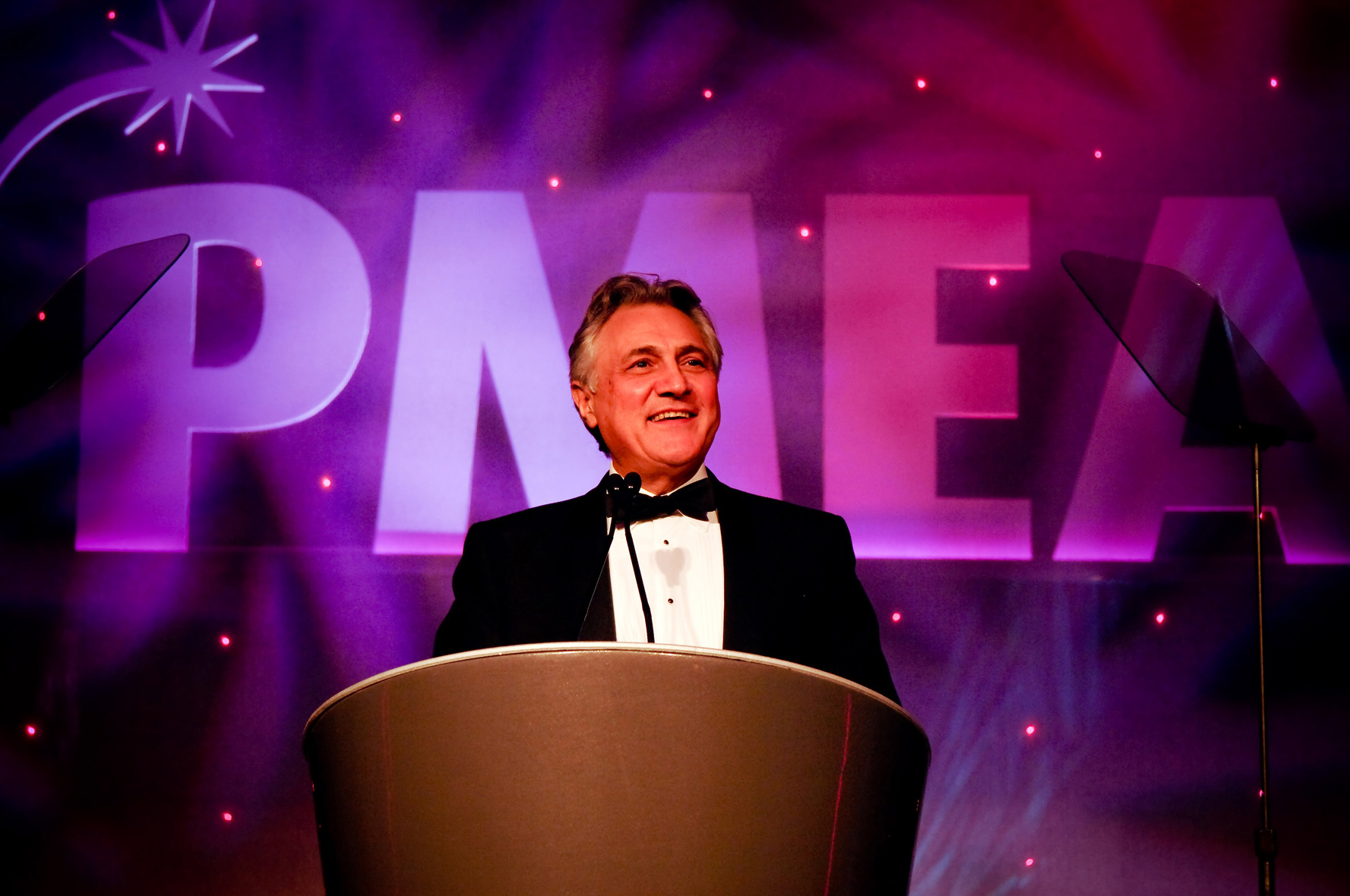
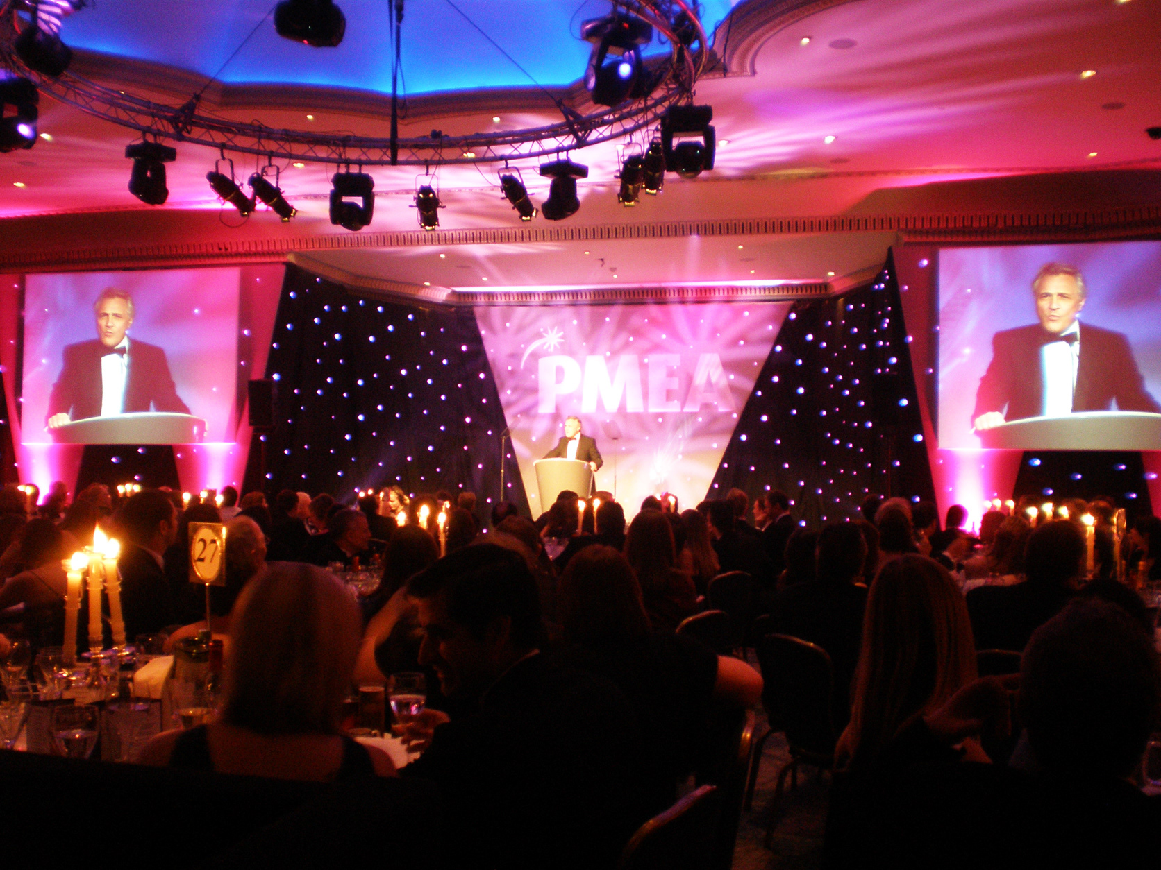
The host for the evening was news reader and television presenter, John Suchet, who entertained the audience with stories from his 35-year career and amusing stories about his brother Poirot! (David Suchet)

The Awards scheme culminates with a presentation evening and black-tie dinner that plays host to 500 guests from a range of companies within the marketing industry.
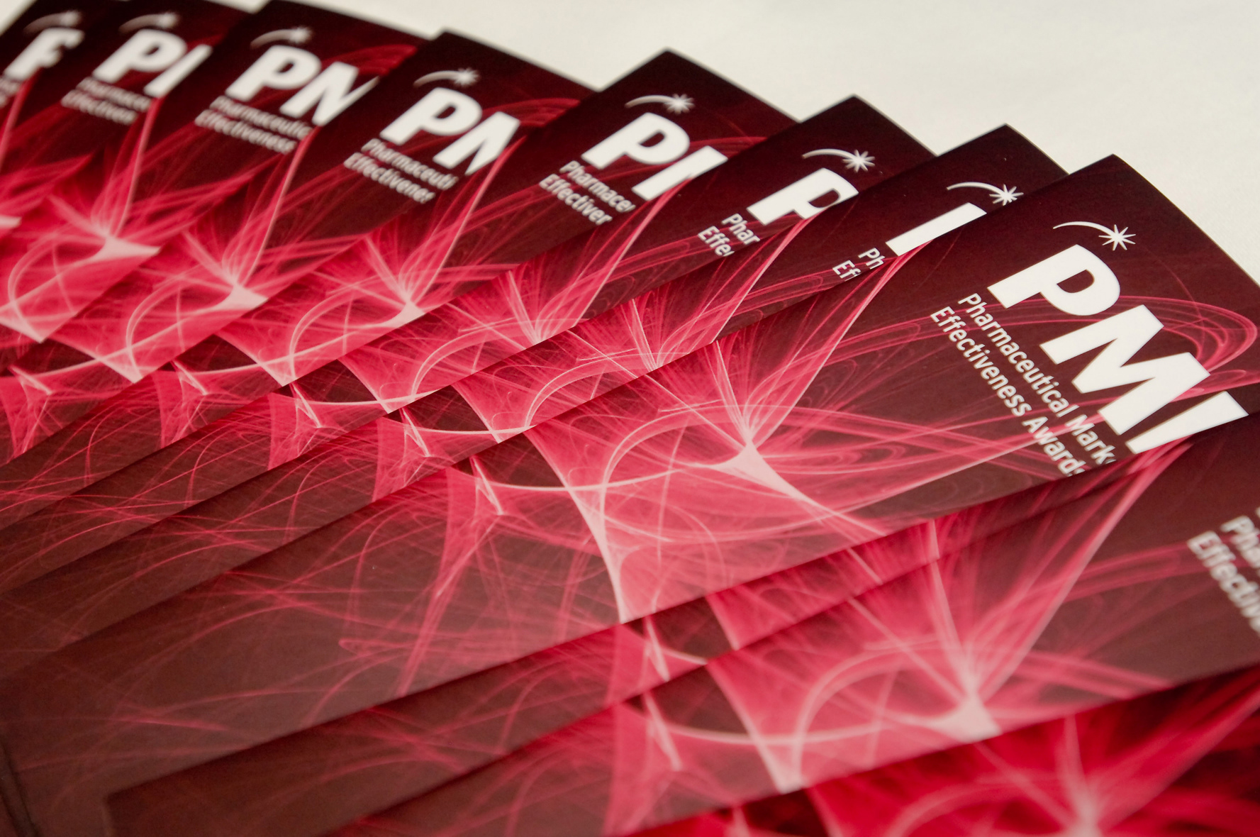
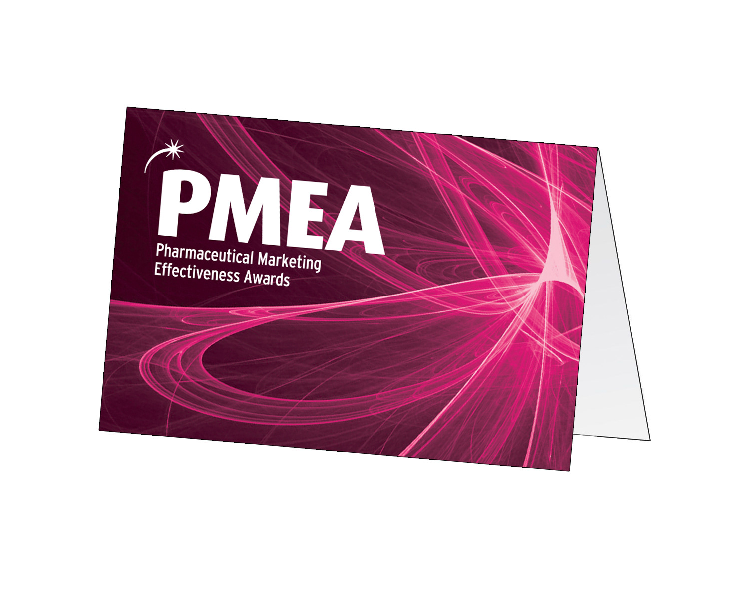
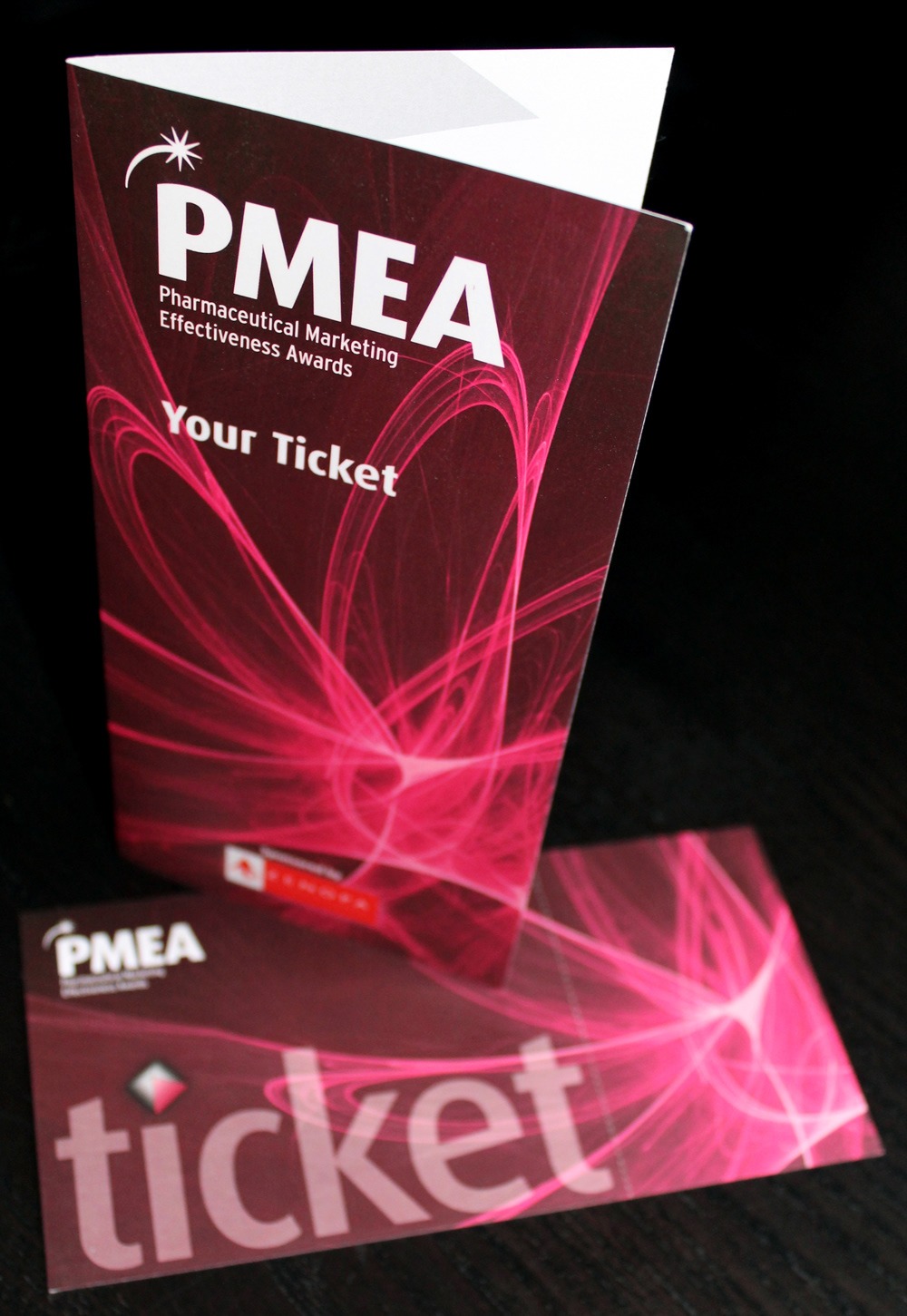
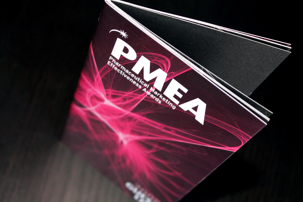
A main image is used throughout the awards scheme to brand the event. For 2008 a vibrant 'spirograph' image was used to represent movement and energy.

The PMEA brand colour is a deep maroon combined with a lighter shade of pink to highlight key areas. The main font used throughout the project were variations of the Dax family.
The awards project allowed me to design for different print and digital materials. Below are some of the different formats.
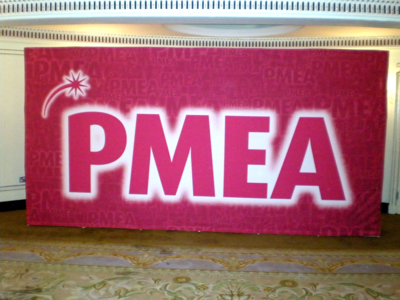
5m x 2.2m Photography backdrop.
A large scale heavily branded backdrop for the award winners to have their photograph taken against. A key consideration with this design was to make sure that even with people standing in front, the logo and branding could still be visible. The backdrop was printed onto a cloth material and attached to a stand.
A large scale heavily branded backdrop for the award winners to have their photograph taken against. A key consideration with this design was to make sure that even with people standing in front, the logo and branding could still be visible. The backdrop was printed onto a cloth material and attached to a stand.

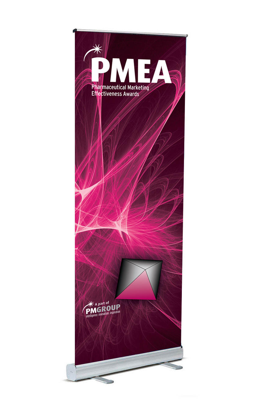
Several pop up stands were used to brand and decorate the larger areas of space at the event.
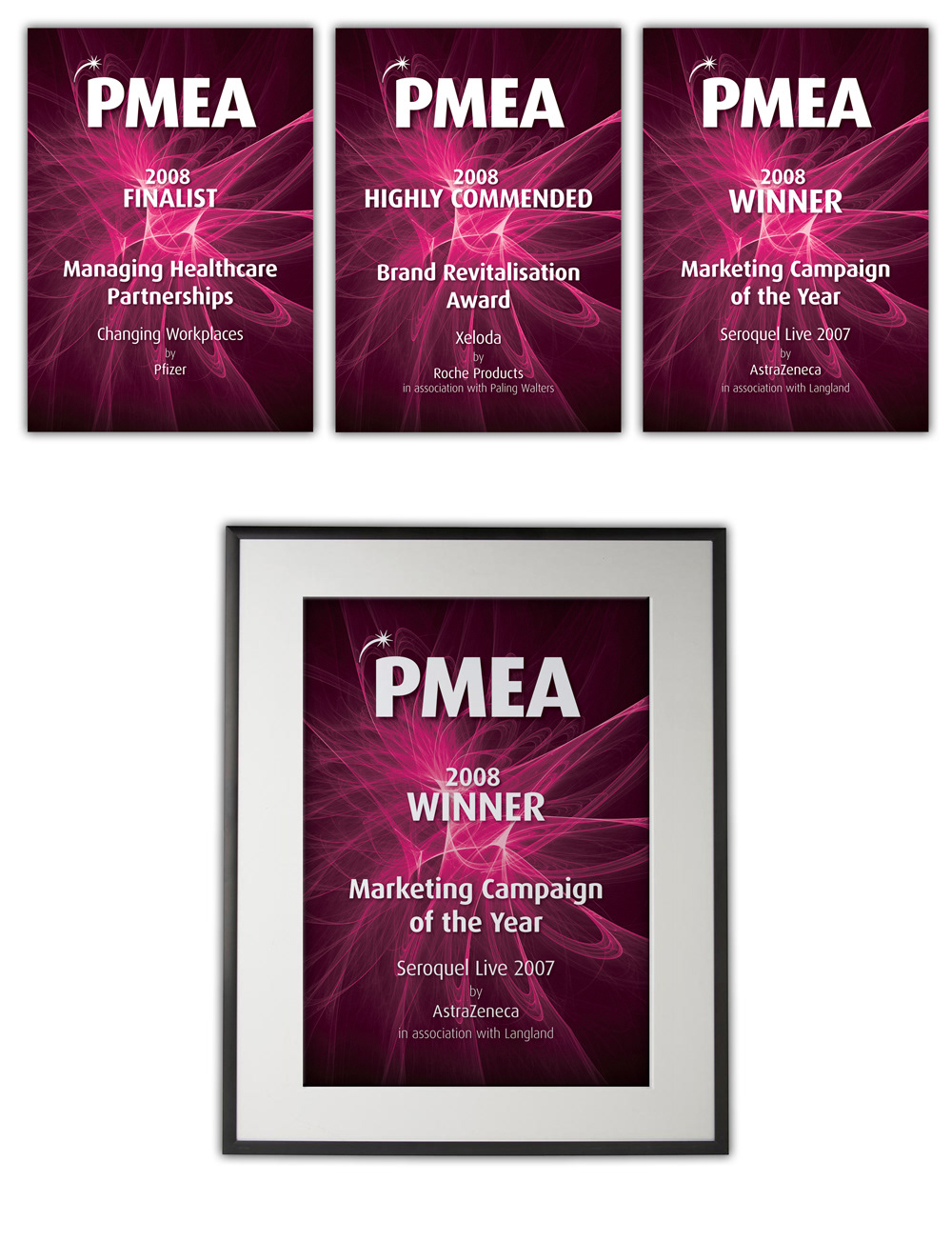
All entries received an A4 gloss certificate. The highly commended and winners were given a framed certificate on the night.
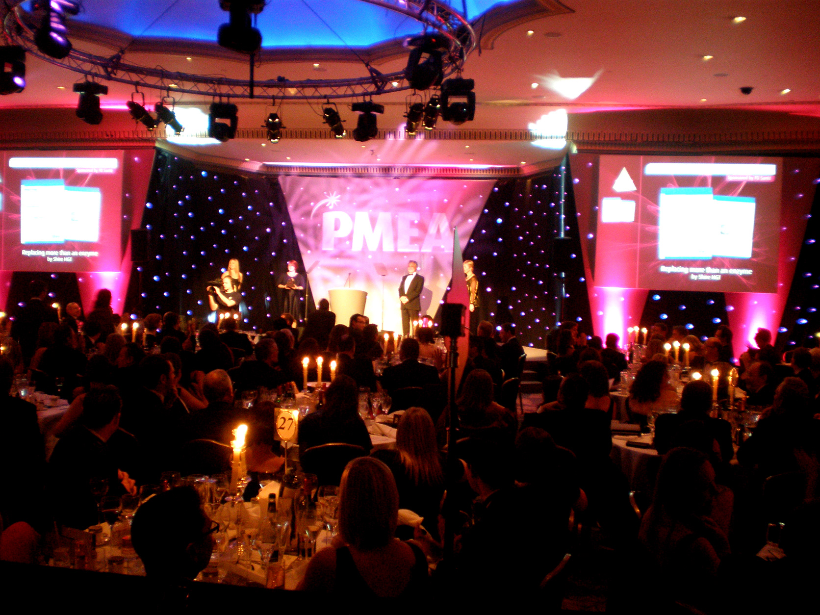
At either side of the stage are two screens relaying the presentation of the awards whilst also cutting between a live video feed. We used an external production company (Lonestar Productions) to help produce the event. I supplied them with a storyboard design for the flow of the screen graphics, which they then created in powerpoint.

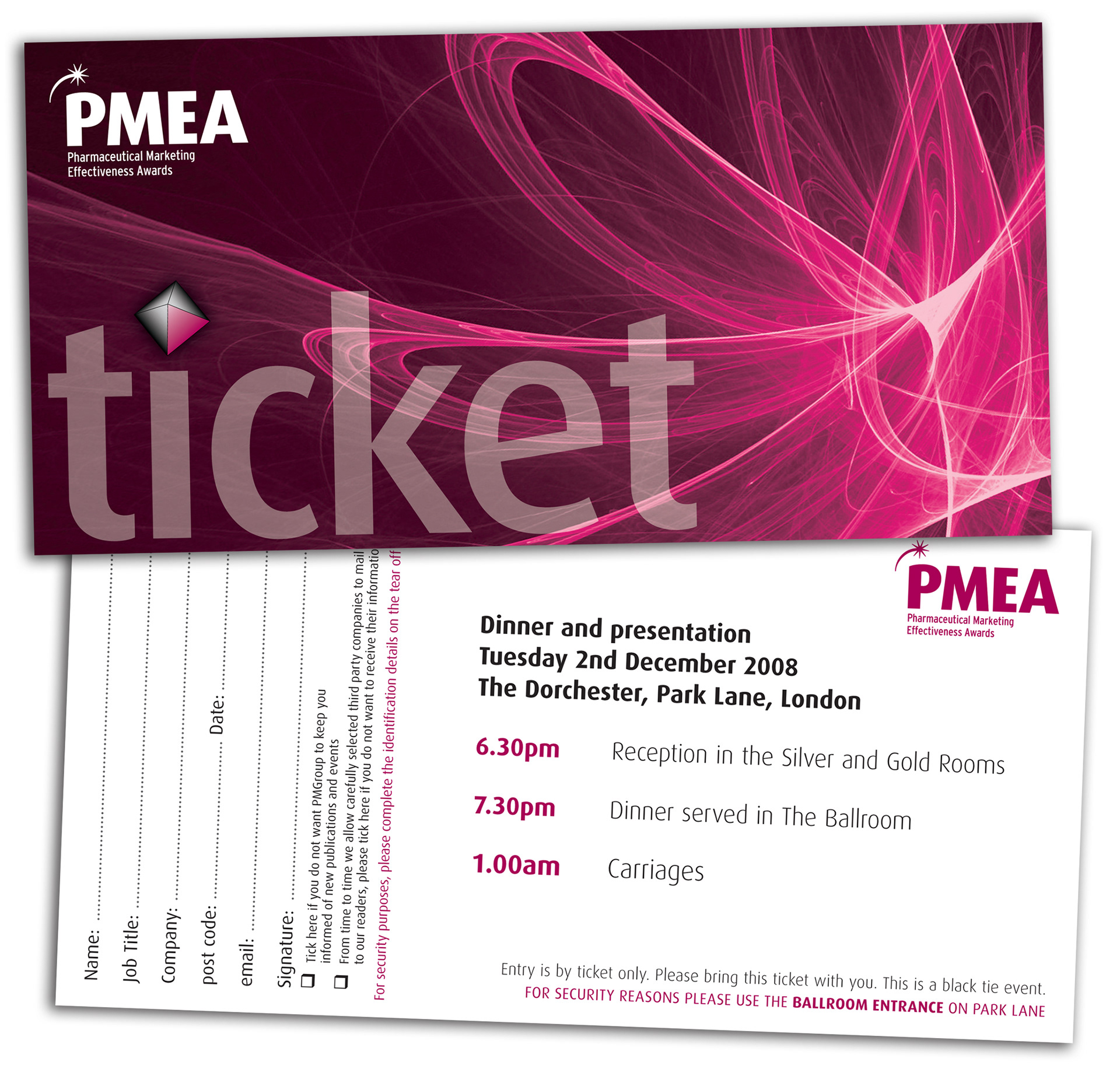
The ticket is printed on 250gsm matt card with a gloss UV finish highlighting the word 'ticket'. The design took into account a tear off strip which was used to collect the attendees details.


An invitation was designed for the sponsors of the award categories. For this, I desaturated the image and made it a heavily contrasted black and white. This was then printed on 250gsm matt card with silver foil used on the word invitation for a classier effect.
The guest list is a 20 page booklet containing details of all attendees, companies and a table plan for the night.

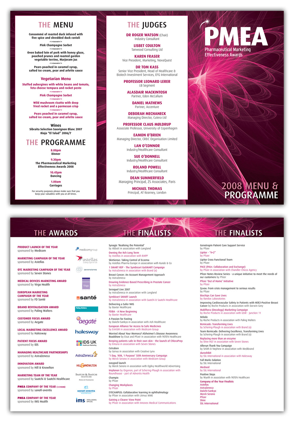
The menu and programme is produced as a tri-fold brochure, containing information on entries, categories, menu, judges and the finalists.